The Storefront Theatre was in dire need for a rebrand. The previous brand was seriously lacking in many aspects. As we do with any project or task set before us we take time to learn as much as we can without judgement about the previous and/or current brand, identity or website. We make it an extremely personal goal to not place judgement on current or previous designs. Design is an evolving practice. If however, we don’t grow or improve it is something that we should reflect on inwardly.
With time and contemplation, we finally realized the issue with the current brand was that the designs focused entirely too much on the shows. Focusing your marketing on the business or organizations product is not a bad thing. Only in the case of the Storefront Theatre we felt that the Storefront was getting lost in the message. Take Apple as an example, customers are hungry for the products but the Apple brand is actually more visible.
A brand is a name, color, term, design, symbol, or other feature that distinguishes an organization or product from its rivals in the eyes of the customer. Brands are used in business, marketing, and advertising.
— Wikipedia
We felt that the previous designs didn’t have any vibrancy to them. Aesthetically, the information and images on the printed materials seemed to blend into the paper while, at the same time the shows seemed to compete with each other. We got the sense that the previous shows adverts seemed to be at war with themselves. Not a good thing when you are competing for attention in a crowded marketplace.
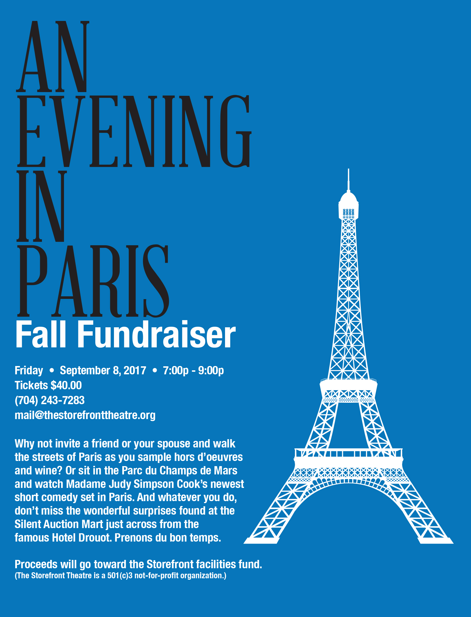
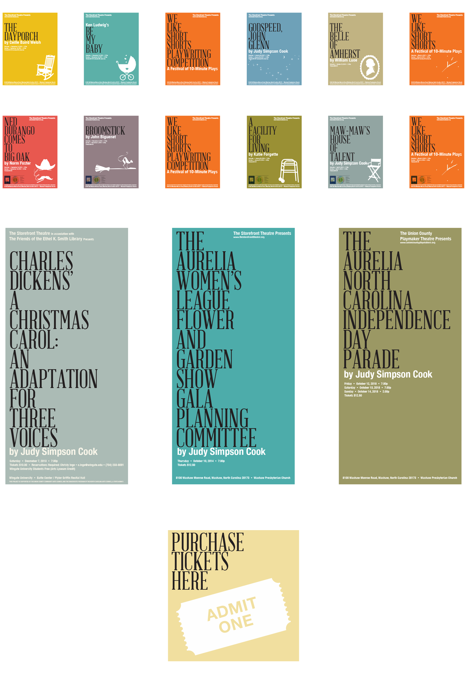
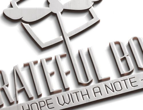
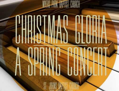
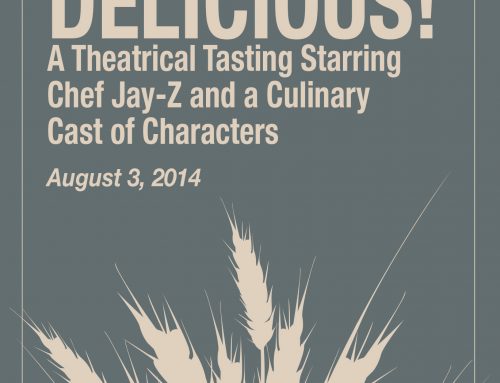
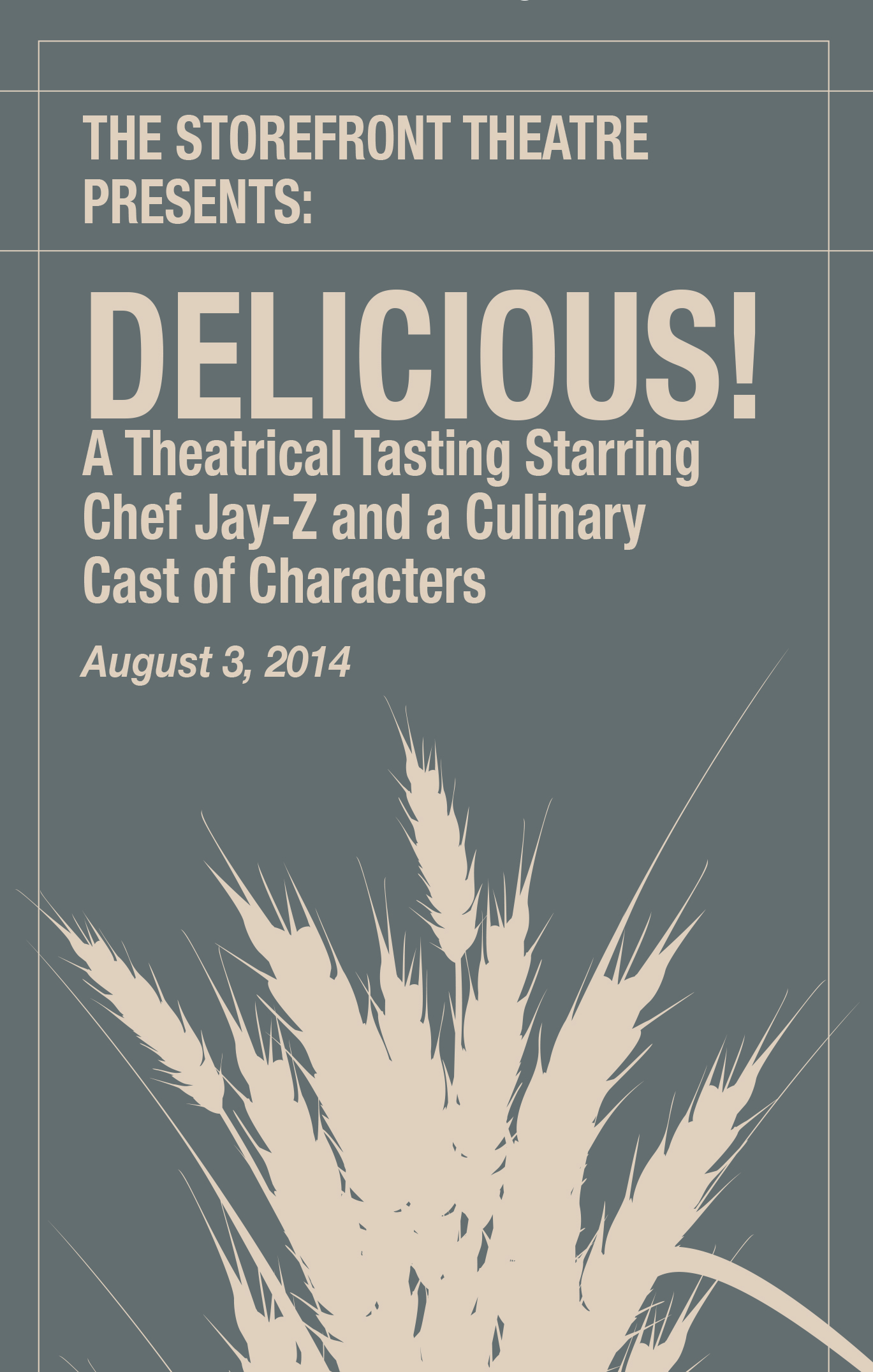
Our plan then was to flip the previous brand. Meaning, that we showcased the Storefront Theatre’s brand over the shows. Then we used colors, two central typefaces and silhouetted or one color images to support the name of the show. The use of these elements was central in quick retention and familiarity. We didn’t want current or potential audience members to have to work to know what the shows were or what they were about. This was important for marketing.
Each individual show had its own color to help it stand apart from the others and to give it a simple personality. Otherwise, everything else took on a template style. The title font and the subtext font remained the same for all the show posters.

Social Contact