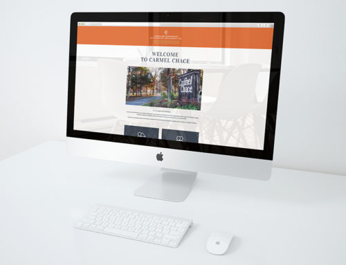
In another example where the client’s expectations were smaller in the beginning then over a cup of coffee growing much broader in scope, Real Life Church (Discover Real Life) was in the process of expanding and thought that they only needed a new logo. This is quite common. Businesses and organizations believe that acquiring only one aspect of a brand is all that is needed to achieve their purpose; just a logo or just a website.
Real Life’s Mission Statement: “To lead people in discovering real life in Christ by creating environments that encourage and equip people to worship God passionately, grow in Christ deeply, and engage the world intentionally.”
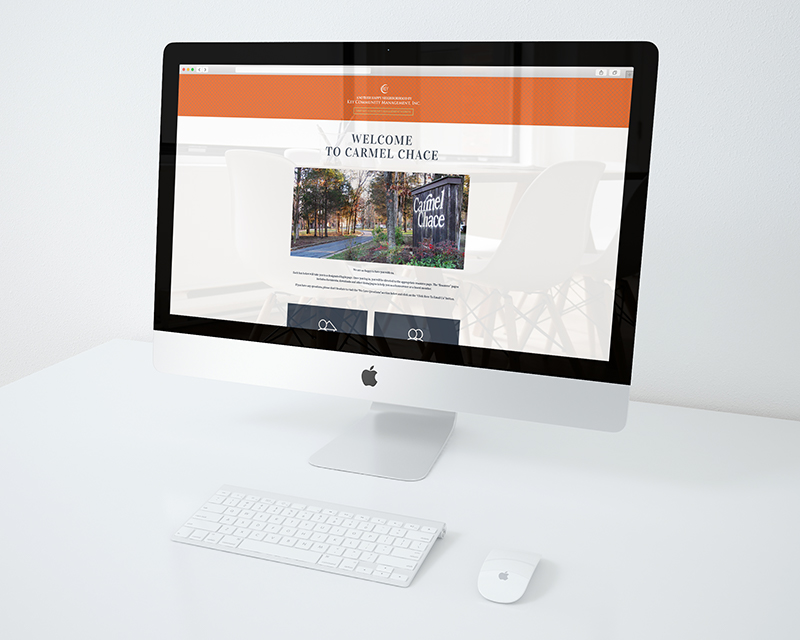
Proof that relationships last
For a bit of backstory, some time ago, we worked with a client on a brochure. Admittedly, we were not overly enthusiastic about the final product. Over time, we lost contact with the client. 10 to 12 years later we received a call from a church we had never heard of before. This church was expanding and was in need of a new logo. We met with the associate pastor overseeing the project and learned more of their plan.
As we met with the various members, staff and pastors we were introduced, or should we say re-introduced to a staff member who turned out to be none other then the client we worked with 10 or 12 years ago on a brochure that we were not overly enthusiastic about. It was this former client, who, by the way, was more then overly enthusiastic over the brochure we created who passed along our name when the question of who could they call for a new logo. Imagine our elation!
Through many, many conversations, reverse engineering Real Life Church’s previous and current brand, visiting Sunday morning services, talking with our contact person at Real Life and getting more insight form the Senior Pastor, we discovered that more than just a logo, they needed a complete rebrand. This included more then just a logo, but an identity, a redesigned website, signage and print materials.
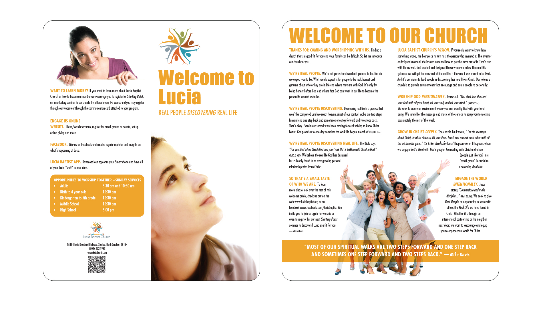
What we learned formed what we created: Organizations, and in Real Life’s case, churches mature. That maturation carries with it new thoughts and personalities. Nothing at Real Life really changed. they just matured. Real Life’s original logo and brand represented a Real Life from a different time and place. Over time, logos and brands lose their impact. The message becomes cloudy or forgotten. Real Life, wanted to reinvigorate its purpose for visitors. Real Life didn’t want to keep God or Real Life a secret. So, that meant re-energizing their “light”, so to say.
What is interesting is that within Real Life’s original name (Lucia Baptist Church), “Lucia” was named for the community where the Lucia campus resides. From our research we learned that “Lucia” is developed from the root form of the Latin meaning light. In further exploration, light is defined as an illuminating agent or source (i.e. sun or star). We, for one, don’t ever think of a community as an illuminating light. Even though Real Life Church no longer carries the “Lucia” name, it still continues to carry in its heart the root form of the Latin meaning light.
We typically begin with the creation of the logo/identity. It’s this identity from which everything else flows from. First, the figures.

The festive characters seem to erupt from an empty center or white hole creating an image of a sunbeam or gleaming star which further enhances the subtle North Star symbolism at the core of this imagery. This idea of a North Star is meant to subtly imply home. The brightness of the North Star, or in our case, the cheerfulness of the logo is meant to always bring us home. The symbolism of strength or pride takes form in the imagery of the forward-thrusting chests of the characters. Together, strength and truth epitomizes the core mission of Real Life. As a whole, the different colors of the figures represents Real Life’s openness; It’s multi-ethnicity. The six different colored figures represents the six different ministries within Real Life.
The white hole represents the nail holes found on the hands of the risen Jesus. The celebration is the result of Jesus’ master sacrifice. Thereby creating a hopeful imagery.
From there we created a set of cards to educate the church members, as well as, visitors.

Overall, our goal was met with immense success. The subtle messaging, the figures, including the set number of figures, the star-shaped symbolism, the colors, the feeling of hope and joy and brightness all contributed to the next life phase of Real Life Church.

Social Contact