The best infographics may look like they were simple to create, but designing an effective data visualization is anything but simple. Why then go through the effort of creating an infographic? The short answer is that it’s easier. It’s easier, at times, to go to the trouble of creating an infographic then it is to explain the vast amount of information needed to an audience. Great infographic design can translate complex data into something everyone should be able to understand at a glance.
It takes a clever combination of words and images to tell a story quickly, concisely and in an entertaining fashion. Infographics make tons of boring information appealing. Being able to break down information and reconstruct it into an aesthetically pleasing and understandable type of “cartoon” has tremendous benefits for a business or organization attempting to “sell” a product to an innocent audience.
Infographics (a clipped compound of “information” and “graphics”) are graphic visual representations of information, data or knowledge intended to present information quickly and clearly. They can improve cognition by utilizing graphics to enhance the human visual system’s ability to see patterns and trends.
— Wikipedia
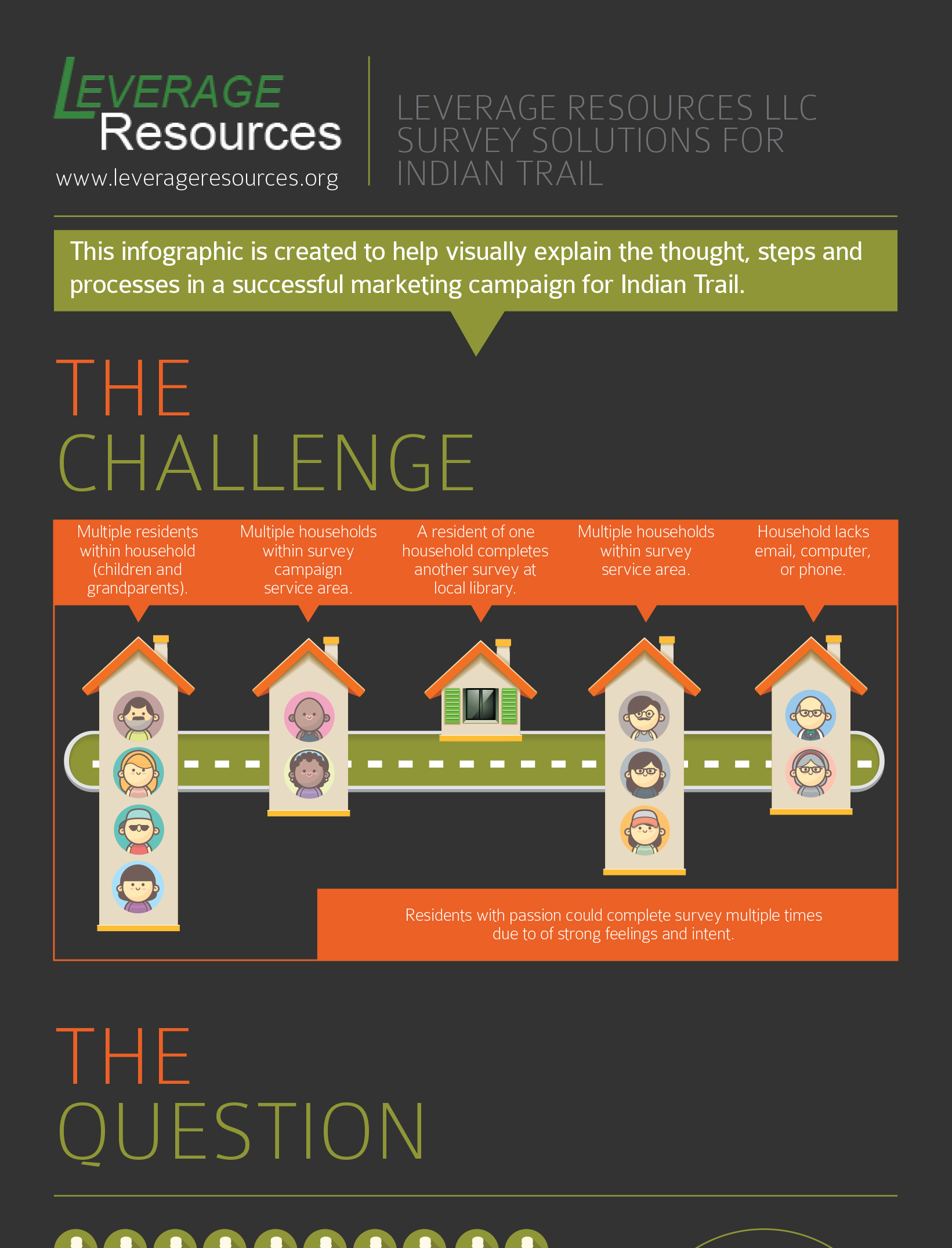
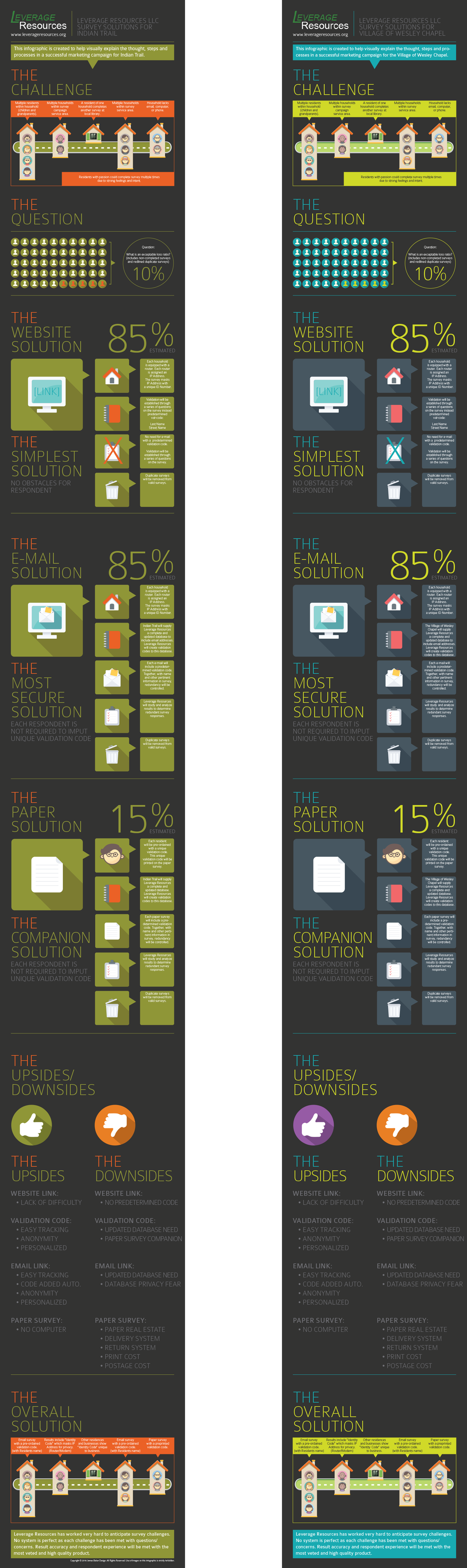
We partnered with Leverage Resources to help two local communities assess the use of existing resources, identify the need for additional resources, or creating new resources in community and state systems to address new identified needs. This included the need and creation of a survey to understand what those needs are. In order to create the survey we needed to understand the importance of attaining the needed information, the importance of the survey itself and the limitations with surveys. We were then scheduled to present our research in a town hall meeting. Understanding that the information we gathered in our research was vast and complicated, we felt that using the infographic approach would better explain our findings to a varied audience.
We did our best to imagine what questions would be asked of the need and use of the survey’s. We also imagined the options the audience would offer as suggestions for how to disseminate the needed survey’s and addressed them in the infographic as a pros and cons.
Finally, we branded the infographics with the municipality branded colors to more personalize the presentation.


Social Contact