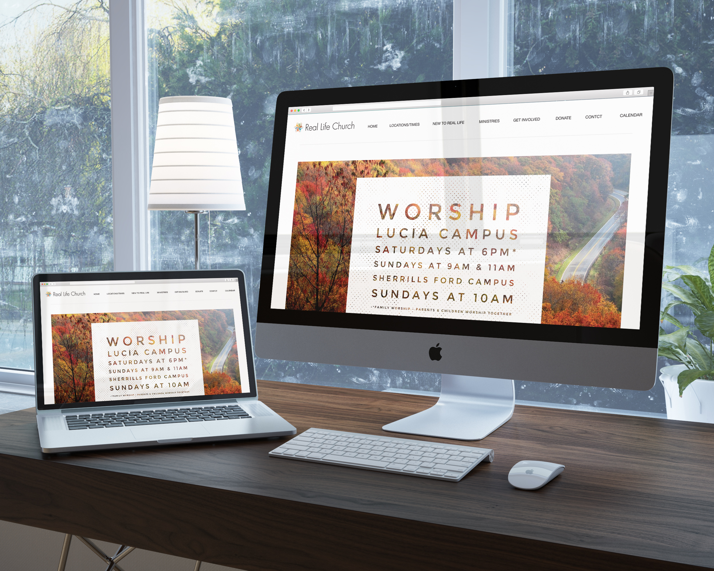
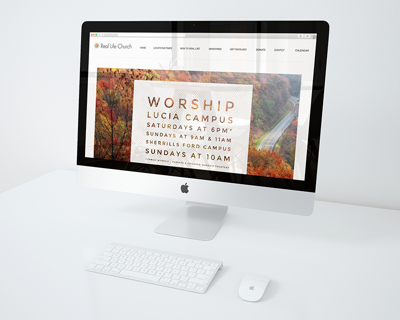
As part of a larger rebrand, we redesigned the Real Life Church (formerly, Lucia Baptist Church) website. Initially, we were tasked with creating just a new logo to match the church’s idea of expanding/growing. You can learn more about Real Life Church’s rebrand project by clicking here or the button at the end of this article.
The previous website was seriously lacking in many aspects. We learned that church members were very dissatisfied with their website experience.
Your church’s website is the front line for your entire ministry. It’s your most important marketing tool. It’s where first impressions are formed. It’s where you get discovered. It’s where new visitors are introduced to you. And it’s where the church family gets information.
Once we formed the new brand, we implemented this new look all across the marketing aspects of Real Life Church. This, especially applied to the website.
An anchor
A website is vital to communicating, both for current members and to potential new members. In the case of Real Life, we wanted to include every feature a church needs to feed it’s members and invite visitors, as well as inform. Since we rolled out a fairly extensive re-brand it was important that we introduce the new brand to the church family because as with any business, church’s family members, first need to be introduced, informed and then educated so that, as essential resources, they can then promote the message laid out in the brand.

We added a FAQ in an attempt to preemptively address any questions the church family may have and to be an anchor to point to for visitors wanting to learn more about what Real Life is all about and what they can offer to them.


Social Contact